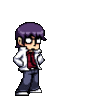
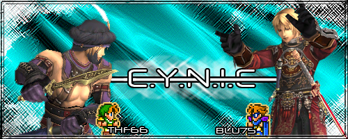
My First Ever Photoshop Project. Opinions Needed!!!

My first ever photoshop project. Opinions needed!!!


Also, stroking the outside makes text look better, generally black. Drop shadow could look nice since your Taru has a shadow as well.

your name looks a little pixely but other than that I like the last one
That's why I suggested him to stroke the outside. Text can look all pixelly when the rest of the photo has a lot of color. A random solid color stands out.
Siren.Snowe said:
Thank you guys for the advice :)
Is there any alternative to the program Autodesk 3ds Max?
I can't buy the actual program and it won't let me download the free trial..
Is there any alternative to the program Autodesk 3ds Max?
I can't buy the actual program and it won't let me download the free trial..
Yes there are some good 3d animation programs that you can download for free online:
Blender:
http://www.blender.org/
Wings 3D
http://www.wings3d.com/
Art Of Illusion
http://www.artofillusion.org/
Ramuh.Haseyo said:
That's why I suggested him to stroke the outside. Text can look all pixelly when the rest of the photo has a lot of color. A random solid color stands out.
I tried to, but it didn't pop out like i wanted it too.. c.c.

I'm really bad at explaining things... just so you know.
No one pointed out really, but your image is over-saturated. Those little red and yellow pixels should not be there. I'm not entirely sure what you did here, perhaps gimp's method of 'contrast' is different than Photoshop's... however you need to do something else. What it appears to me is that you might have used 'levels' instead of 'contrast'... but who knows. Here's how to do as I instructed earlier...
Before:
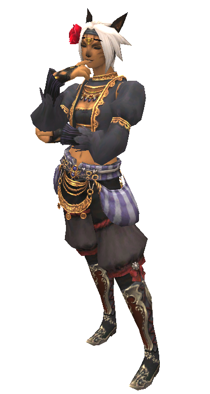
After:
If you have questions, please ask. I'm bad at this.
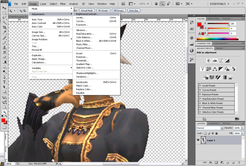
Now onto text. Someone was commenting on how it's pixely.... I'll explain why. It's easily remedied. Or rather... I'll try to explain why. @_@;
Before:

As you can (hopefully) see in this picture, there's a little dropdown box full of options. He's currently on the "none" setting, he just needs to change it to something else. I typically use sharp.
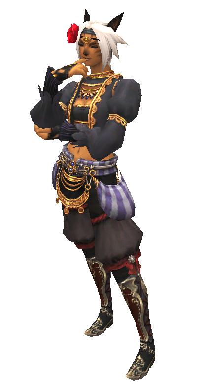
After:

I hope this helped some.
No one pointed out really, but your image is over-saturated. Those little red and yellow pixels should not be there. I'm not entirely sure what you did here, perhaps gimp's method of 'contrast' is different than Photoshop's... however you need to do something else. What it appears to me is that you might have used 'levels' instead of 'contrast'... but who knows. Here's how to do as I instructed earlier...
Before:
After:
If you have questions, please ask. I'm bad at this.
Now onto text. Someone was commenting on how it's pixely.... I'll explain why. It's easily remedied. Or rather... I'll try to explain why. @_@;
Before:
As you can (hopefully) see in this picture, there's a little dropdown box full of options. He's currently on the "none" setting, he just needs to change it to something else. I typically use sharp.
After:
I hope this helped some.
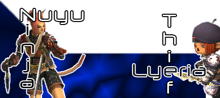
Hey guys was going to post a thread just like this one till I found this one and thought i'd hijack it. xD
Ok as like the op this is my first try at making a sig so some tips as to what i can fix/add would be great.
Btw I know i'm really bad at this. ><
Ok as like the op this is my first try at making a sig so some tips as to what i can fix/add would be great.
Btw I know i'm really bad at this. ><

Get a background, even if you're aiming for a dark one a completely empty background looks awful. I'd recommend something either relevant to the game, a random image from the net or even play with water colors and adjust your image for it.
I like the effect you're going for with the elvaan, but you could blur the cross over lines or smudge them for a more seemless effect and possibly sharpen the model since game pixels are pretty blurry as it is.
Finally the text color/size, looks far too striking to me.
I like the effect you're going for with the elvaan, but you could blur the cross over lines or smudge them for a more seemless effect and possibly sharpen the model since game pixels are pretty blurry as it is.
Finally the text color/size, looks far too striking to me.
Cool thanks for the advice dark currently working on a background after that i'll get to the blur/text should be finished by tonight ty. ^^
")
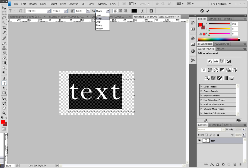
A quick way to sharpen the edges of your images uses the Gausian Blur option. After selecting it, put the number up a little bit at a time and you'll see the edges blur out~
As for text on backgrounds, I find adding a very thin "Stroke" effect around the text works very well, only 1-2px in either Black or White (and occasionally shades of Grey work well too). Just make sure the text is coloured to go along with it!
It's been forever since I've played with Photoshop, but I have some old stuff on my Photobucket that I think work well as examples.
http://img.photobucket.com/albums/v54/Deathcat/bluthf.png
http://img.photobucket.com/albums/v54/Deathcat/fa135a2b.png
http://img.photobucket.com/albums/v54/Deathcat/sig1.png
http://img.photobucket.com/albums/v54/Deathcat/carson-border.png
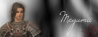
http://img.photobucket.com/albums/v54/Deathcat/meg.png
As for text on backgrounds, I find adding a very thin "Stroke" effect around the text works very well, only 1-2px in either Black or White (and occasionally shades of Grey work well too). Just make sure the text is coloured to go along with it!
It's been forever since I've played with Photoshop, but I have some old stuff on my Photobucket that I think work well as examples.
http://img.photobucket.com/albums/v54/Deathcat/bluthf.png
http://img.photobucket.com/albums/v54/Deathcat/fa135a2b.png
http://img.photobucket.com/albums/v54/Deathcat/sig1.png
http://img.photobucket.com/albums/v54/Deathcat/carson-border.png
http://img.photobucket.com/albums/v54/Deathcat/meg.png

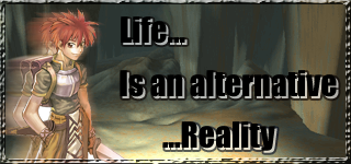
Well here's my first sig attempts, I didnt use photoshop though, used paint.net (and stole most of the stuff in it >.>) but it's my first attempt >< lol
Wow very nice if you don't mind me asking how did you get the semi-shaded guy in the first one?
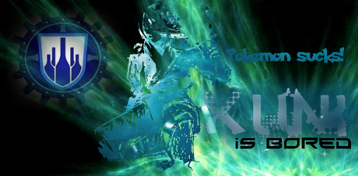
Hey! Pokemon does not suck. ;_;

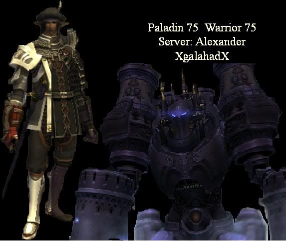
Alexander.Xgalahadx said:
Hey guys was going to post a thread just like this one till I found this one and thought i'd hijack it. xD Ok as like the op this is my first try at making a sig so some tips as to what i can fix/add would be great. Btw I know i'm really bad at this. ><
Btw I know i'm really bad at this. ><the fact you have a dark character amongst a dark background really doesnt bring anything out and makes it all blend..
also th way you've literally put your player in half is a bit.. "eek"... you could blend it in on different layers so it looks a bit smoother, or just have 2 characters on the picture i know a lot of people do.
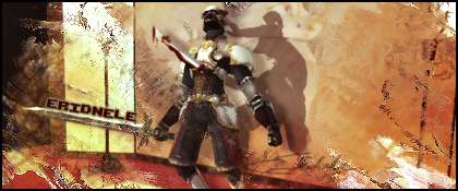
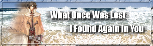
the easiest way around the character blending into the back ground is like a few have said here.. stroke.. using my sig as an example

not the greatest ive ever done by all means just something quick. but it just brings out the characters from the busy background.
layers are your friend.. play around with them as much as you can to get different effects and you can go back without affecting the ENTIRE picture. send me PM if you want me to show you further examples
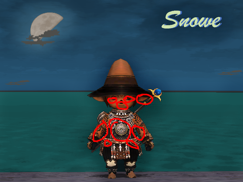
Siren.Snowe said:
 Another "project". I'm quite satisfied with this one.. looks pretty good i think. You guys?
you missed a bit of dark between ur legs too.. looks like your wearing a cloak, not immediately obvious.. but when your asking people to criticise.. :P you'll get it lol
[edit] sorry for double post.. wanted to answer two different parts of the OP in different posts so not to confuse
The clouds in front of the moon are pretty pixelated. I'm no art student (I'm an amateur myself), but I just tweak color saturation and contrast to make screenshots stand out more. Sometimes I play with the poster edge and film grain filters to give it some flair. Depending on the settings, you can get a comic book look to it like this:
http://static.ffxiah.com/images/ss/mid/snuffleupagusQO2v0f9oA6hL.png
or you can go the opposite and soften it into a watercolor like this:
http://static.ffxiah.com/images/ss/mid/snuffleupagusAon08Co67dAZ.png
http://static.ffxiah.com/images/ss/mid/snuffleupagusQO2v0f9oA6hL.png
or you can go the opposite and soften it into a watercolor like this:
http://static.ffxiah.com/images/ss/mid/snuffleupagusAon08Co67dAZ.png
ya its in jpeg oh well
[+]

if you were talking to me. i was just necro bumping lol. been using photoshop for years and ya color balance is a great thing to use i use it all the time lol. the only brush i used in that was a blood splatter brush on the gkt. and this is color balanced btw xD the original was very dull of course


All FFXI content and images © 2002-2024 SQUARE ENIX CO., LTD. FINAL
FANTASY is a registered trademark of Square Enix Co., Ltd.